
Online Layer
Online layers are data sets, maps or pois that are loaded via the Internet and then displayed on the map.
Click on Online overlay Layer in the map toolbar and select the desired layer:

A loaded layer is marked by a check mark. To deactivate it, click on the entry again. You can also unload a layer in PM.
OpenStreetmap Pois
Shows OSM-Pois on the map. E.g. petrol stations, e-charging stations, hotels etc. In the project manager you control which Pois categories you want to see:
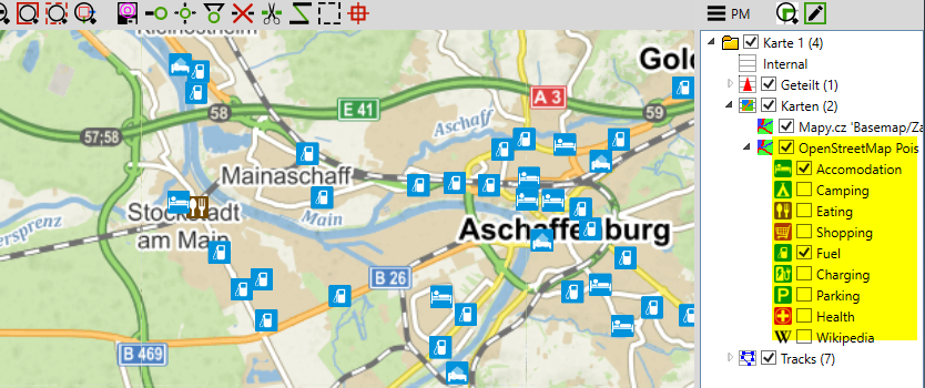
Pois are only drawn from level 11 or a scale of about 1:150.000. The reason for this is that otherwise there would simply be too many.
However, if you are travelling in sparsely populated areas, e.g. Patagonia, you may want to see all petrol stations in a larger overview. For this purpose there is the slider Poi Offset in the layer info:

If you reduce the value, the pois are drawn earlier and you have a better overview. If you increase the value, the pois will come later, this could be useful in city centres to not see too many pois too early.

Note: The poi data is downloaded online from the osm server, always in tiles of 1° x 1°. These tiles are then cached internally and are then available offline. So the first time you call the poi layer it may take some time. Since the OSM data status is constantly changing, you can occasionally clear the cache on the Info Cache page to get the latest data.
TOURIST DIRECTORS Pois
Bing traffic
Motorcycle track closures
OpenWeather Clouds, Rain
Weather Icons
Covid19 Global Cases
This layer downloads the case data of the Covid19 pandemic and places it on the map with a coloured dot for each country in the world.
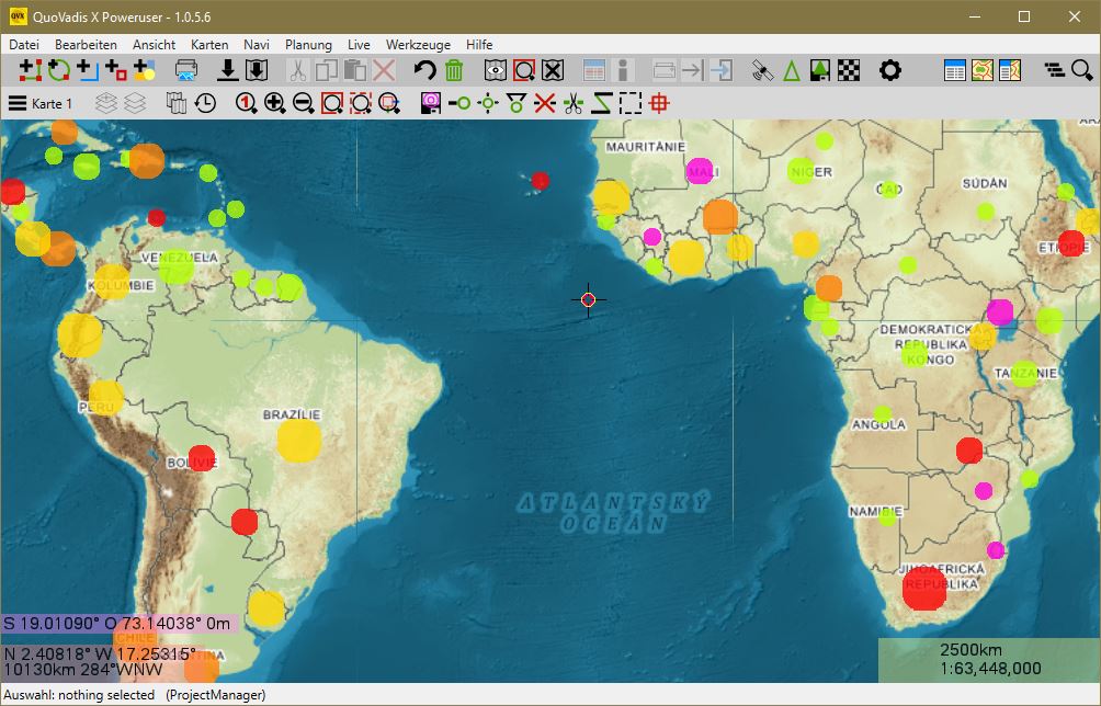
The data is downloaded daily from Datahub.io. The data set is currently updated once a day and corresponds to the status of the previous day. They are provided by the team of the Center for Systems Science and Engineering (CSSE) of Johns Hopkins University.
The size of the points corresponds to the current number of cases. The colour represents the current change compared to the previous day in the order green-yellow for a change up to 5%, yellow, orange, dark orange, red to violet for a change greater than 50%. A grey dot means that no data is available yet.
If you move the mouse over a point, you will see the current number of cases and the change from the previous day in %:

To see more information, right-click on an item and select Info from the context menu:
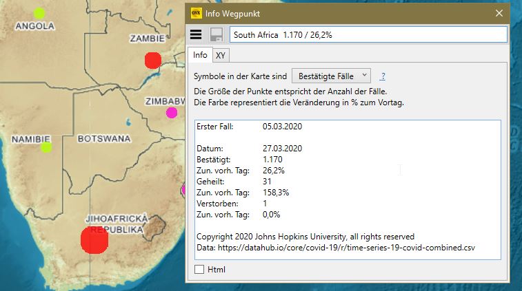
You can choose whether the symbols in the map should represent the confirmed, the healed or the deaths.
On the XY side, the data is displayed as a curve over time. Click on a curve to get the exact value at that point.

With the Options button you can show and hide individual curves:

Note that the Y-axis logarithmic is